Create A Blog With Gridsome & Vue
This is a tutorial about creating a simple blog using Gridsome.
In this post I will cover the following:
All the code for this tutorial can be found over here.
Initialize the project
First you will need to create a new project by writing in the terminal the following:
npx gridsome create the-best-blogIn this step, Gridsome will bootstrap your project and install all the dependencies.
The project structure that will be generated here will be something like this:
the-best-blog
└───node_modules
└───src
│   └───components
│   └───layouts
│   │   └───Default.vue
│   └───pages
│   │   └───About.vue
│   │   └───Index.vue
│   └───templates
│   └───favicon.png
│   └───main.js
└───static
│───gridsome.config.js
│───gridsome.server.js
│───package.json
│   ...
The Gridsome's Docs does a good job explaining the purpose of these files.
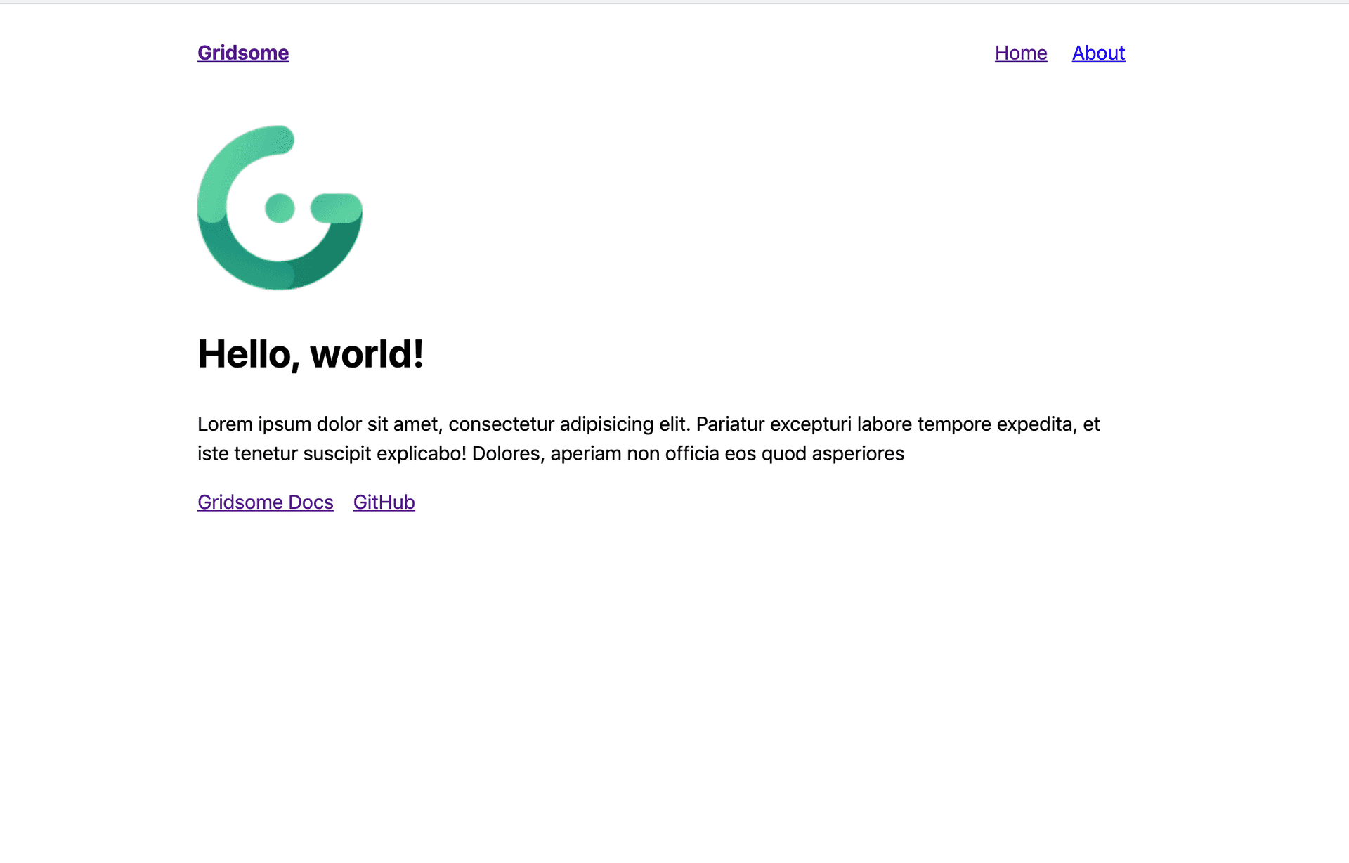
Now lets start your dev server:
gridsome developBy visiting http://localhost:8080 you should see something like this:
Now that you have initialized the project, you get few things out of the box.
- Progressive Lazy loading for images using the
g-imagecomponent. - GraphQL , You can play around with the explorer by visiting
http://localhost:8080/___explore. - Hot reload development environment.
- A web app that follows the JAMstack architecture.
Vuetify & SCSS
Vuetify
Vuetify is a rich Vue component library built on top of material design.
To add Vuetify to the project you can do the following:
- Add Vuetify to the dependencies
yarn add vuetify --dev- Import Vuetify to the project
Your main.js file should look something like this:
import Vuetify from 'Vuetify';
import DefaultLayout from '~/layouts/Default.vue';
import 'Vuetify/dist/Vuetify.min.css';

export default function(Vue) {
  Vue.use(Vuetify);
  // Set default layout as a global component
  Vue.component('Layout', DefaultLayout);
}- Whitelist Vuetify as an external dependency
First you need to add the webpack-node-externals package to your devDependencies.
yarn add webpack-node-externals --devAfter that you should add Vuetify as a white-listed dependency inside the file gridsome.server.js like this.
const nodeExternals = require('webpack-node-externals');

module.exports = function(api) {
  api.chainWebpack((config, { isServer }) => {
    if (isServer) {
      config.externals([
        nodeExternals({
          whitelist: [/^Vuetify/]
        })
      ]);
    }
  });
};- Add Vuetify's v-app component
Last step is to wrap your layout with Vuetify's app component.
Inside the default layout (Default.vue) you should change the html to be like this:
<template>
  <v-app>
    <div class="custom-layout">
      <header class="header">
        <strong>
          <g-link :to="{ name: 'home' }"
            >{{ $static.metaData.siteName }}</g-link
          >
        </strong>
        <nav class="nav">
          <g-link class="nav__link" :to="{ name: 'home' }">Home</g-link>
          <g-link class="nav__link" :to="{ name: 'about' }">About</g-link>
        </nav>
      </header>
      <slot />
    </div>
  </v-app>
</template>
Note that the class layout has been changed since Vuetify has its own class with the same name. To avoid any conflicts the layout css in the component has been renamed to custom-layout. Don't also forget to add the width: 100% bit.
.custom-layout {
  max-width: 760px;
  margin: 0 auto;
  width: 100%;
  padding-left: 20px;
  padding-right: 20px;
}
SCSS
Adding SCSS is quite straightforward. You will just need to add the loaders as dependencies.
yarn add sass-loader node-sass --devNow you can for example update your default layout to use scss like this:
<style lang="scss" scoped>
  $margin-size: 20px;

  body {
    font-family: -apple-system, system-ui, BlinkMacSystemFont, 'Segoe UI',
      Roboto, 'Helvetica Neue', Arial, sans-serif;
    margin: 0;
    padding: 0;
    line-height: 1.5;
  }

  .custom-layout {
    max-width: 760px;
    margin: 0 auto;
    width: 100%;
    padding-left: $margin-size;
    padding-right: $margin-size;
  }

  .header {
    display: flex;
    justify-content: space-between;
    align-items: center;
    margin-bottom: $margin-size;
    height: 80px;
  }

  .nav__link {
    margin-left: $margin-size;
  }
</style>
First Post
Now that you have the project initialized, you need to add the support to loading the content for the blog posts. You can do that by adding the filesystem plugin. This plugin makes creating content using markdown files a breath.
A filesystem source will also require a transformer in order to parse the files. You can make use of Gridsome's transformer-remark.
To move forward do the following:
- Install dependencies
yarn add @gridsome/source-filesystem @gridsome/transformer-remark --dev- Add the plugin and the transformer to Gridsome's config
Edit your gridsome.config.js to look like this:
module.exports = {
  siteName: 'The best blog',
  plugins: [
    {
      use: '@gridsome/source-filesystem',
      options: {
        path: 'static/posts/**/*.md',
        typeName: 'Post',
        route: '/:slug'
      }
    }
  ],
  transformers: {
    remark: {
      externalLinksTarget: '_blank'
    }
  }
};
These changes tell Gridsome that you would like to make use of the plugin @gridsome/source-filesystem and the remark transformer.
Note that the plugin options sets up the routes of every post based the slug value in the markdown file. For example, a post with a slug the-best-post will have the route /the-best-post.
Also it defines which template to use, in this case the tempalte is Post.
Next you will need to create the template inside templates/Post.vue.
The initial template can be something like this:
<template>
  <Layout>
    <h1 v-if="$page.post">{{ $page.post.title }}</h1>
    <div v-if="$page.post" class="h4 pb-3">
      Written by:
      <g-link to="/about">{{ $page.post.author }}</g-link>
      - {{ $page.post.date }}
    </div>
    <div v-if="$page.post" v-html="$page.post.content"></div>
  </Layout>
</template>

<page-query>
query  Post ($path: String!) {
  post: post (path: $path) {
    title
    content
    author
    date (format: "D. MMMM YYYY")
    description
    keywords
  }
}
</page-query>

<script>
export default {};
</script>

<style scoped></style>
The code here fetches the post's data using GraphQL. These variables must match the data you have in the post's markdown (more on that in a moment).
In case you are not familiar with GraphQL, the code simply fetches data of type post and it is defining the schema the component would like to have.
Now to test this you can create your first post! 🔥
To achieve this you need to create a new directory called posts. Inside the directory will live all your blog posts. Of course you could have the posts somewhere else, its just a matter of a personal preference. I prefer to have one directory per blog post to have all the assets related to the post added there as well. If you decide to change the structure, remember to update the configs in the gridsome.config.js file.
The initial post can be over there:
static/posts/the-best-post/the-best-post.md
The content can be something like this:
---
slug: the-best-post
title: The best blog post
date: 2019-01-16
author: The best author
keywords: best, blog post
description: The best blog post ever.
---
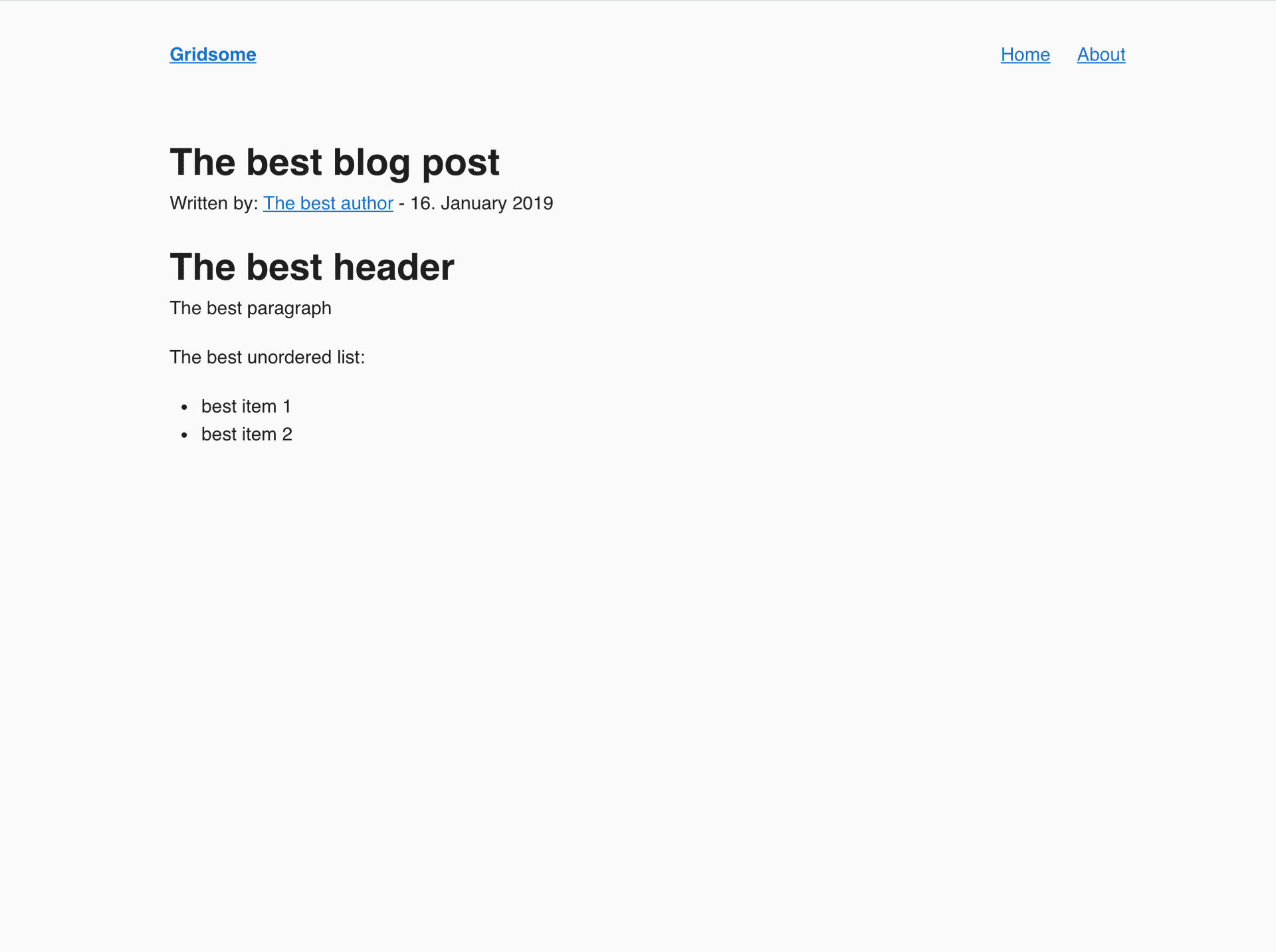
# The best header
The best paragraph
The best unordered list:
- best item 1
- best item 2Remember to reload your dev server and then navigate to localhost:8080/the-best-post, you should see something like this:
Now you have the basic functionality for your blog in place.
To build the project the following command can be used.
yarn run buildAll the built files will be stored under the /dist directory.
Gridsome will fetch all the content during this build process and you will have your blog ready to be served with all the content. This aligns greatly with the JAMstack way of doing things.
Now all you need to do is to style the blog and add all necessary other static content & metadata and you are good to go! 👍
Once you are ready with your blog, you can upload it to Netlify for hosting. The folks at Netlify have made it so easy to do things that I feel it does not need any detailed explanation. Just check their docs and your blog will be up and running in no time.
Hopefully you found this helpful! As I mentioned earlier, all the code for this tutorial can be found over here. If you have any questions, feel free to ask me on Twitter. Enjoy! ✌️